Updated May 2025. While the US Census Bureau doesn’t publish population projection data, each state individually produces projections that state agencies use to make policy decisions and that businesses can use to make business decisions. We include the population forecast data in Radius Reports and when requested in Custom Data projects. Below are 50 of our favorite population projection datasets for counties for each state in the US.
50 of our Favorite Population Forecasts by County Datasets
If you need projections for counties in different states, you’ll need to purchase projections that use the the same methodology so that they’ll be apples to apples comparable. We’ve teamed up with Cooke Demographics to provide such county population projections that include age and sex data for years 2022-2047. Learn more about our County Population Projections here: Link
Other companies that we have worked with in the past that provide county population projection data are AGS (Applied Geographic Solutions), Woods & Poole Economics, Nielsen and ESRI.
County Projections are handy and all, but what I really want are Population Projections by Cities.
I hear you! The smaller the geography, the better…as long as the data are accurate, right?
The first stop in your hunt for population forecasts for cities is to check the agency website in the table above. Some state agencies, like Arizona, provide population projections for cities along with counties. Be aware they might use an unexpected name for cities like sub-counties or places. So you’ll want to do some digging through data files here rather than just reading the file names. After digging and if you still don’t find the data you need, continue your search with the two options below.
If you need population projections for just 1 city…
You can often find population projection data for 1 city in the city’s comprehensive plan, and here’s how.
Search for the city’s comprehensive plan in Google (e.g. City of Austin comprehensive plan).
TIP! Sometimes, you have to navigate to the city’s website & then search for the plan on their site. It’s usually linked from the planning department’s webpage.
When you find the plan, search in the text of the plan for the words “projection” or “population”.
TIP! If the text of the plan isn’t searchable, look in the table of contents. Usually, there’s a section in the table of contacts that’s titled “environment” or “population.” Sometimes, this section is in an Appendix, but usually, it’s at the very beginning of the document. Read through only this section of the plan to see if you can find population projection data.
Also consider how old the plan is. If the plan is older than 2010, consider looking for this data on the MPO’s website (next step) first and then coming back to the comprehensive plan if you can’t find it on the MPO’s website.
If you need population projections for multiple cities in a region…
The metropolitan planning organization (MPO) often publishes population projections for multiple cities in a region to estimate traffic demand. MPOs are federally mandated and funded transportation policy-making organizations in the United States that are made up of representatives from local government and governmental transportation authorities (source). To find population forecasts in MPO planning documents, first you have to figure out if your city is in an MPO and if so, which MPO.
If you don’t already know, do a Google search for what county the city is in (e.g. “What county is Austin, Texas in?”).
Then google search for what MPO the county is in.
TIP! You may have to google for a “map of MPOs for the state of _____” and use the map to figure this out.
Go to the MPO’s website and find the long range transportation plan. It’s usually called something like MPO Year Plan (e.g. CAMPO 2040 Plan) or 2040 transportation plan.
Open the plan, and search for the words “projection” or “population”.
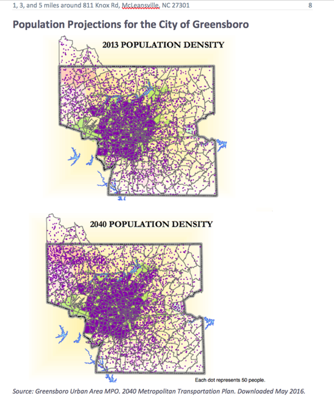
Sometimes, the population projections in the plan are for cities. Other times, the population projections are for Traffic Analysis Zones (or TAZs). If we can’t find population projections for cities, you can use the Traffic Analysis Zone map. See the sample below for what a TAZ population projection map could look like.
Don’t Have Time to Pull This Data Yourself?
Whew! Still reading? I’m impressed.
So if you’ve gotten this far and you’re thinking, “Yeah, sure I could pull all of this data myself in a couple of days, but I have other important things to do and I really don’t want to sift through all of the data dictionaries, methodology statements and tool instructions to make sure that I have the most current data for my area of interest,” you are not alone. You sound just like our other clients at Cubit who depend on us to provide clean, accurate and easy-to-work-with data as well as human-to-human customer support. You can get population projections, as well as hundreds of other data points, in a custom data pull. Prices start at $599 with a 3 business day turnaround. Tell me what data you need for what geography & I’ll get you a free quote & turnaround estimate.
People who don’t work with demographic data day in and day out often don’t know that the US Census Bureau collects many other datasets in addition to the Decennial Census that we all have to fill out. The Census’ Building Permit Survey is a lesser known dataset but still a valuable resource. The dataset contains the number of new housing units authorized by building permits, the type of housing (e.g. single family) and unit value.
Data Details: US Census Bureau’s Building Permits Survey
What: Building Permits
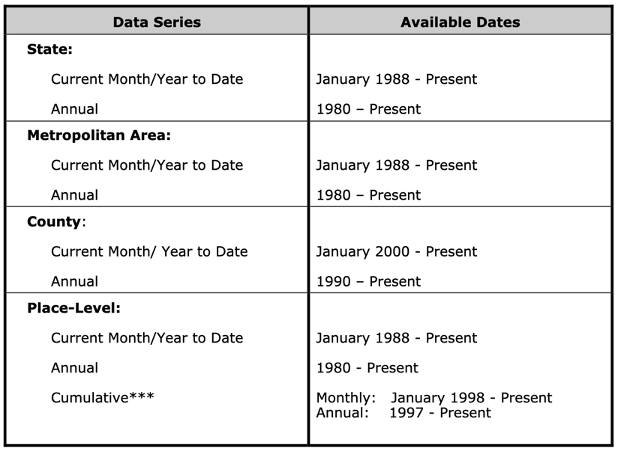
Who: Small-ish geographies include States, Metropolitan Areas (CBSAs), Counties and individual permit-issuing places (large cities)
Historic data: Yes but it’s complicated. See below for details.
Join on: FIPS id
What the Building Permit data look like
Possible problems with Building Permit data
The monthly files provide data for all counties that are requested to report monthly (about 900+). So there’s not new data each month for all counties. And there are no data at all for small population cities – which make sense because most of them don’t have that many new buildings going up.
On years that end with 4, the agency updates which places are included in the universe. Below is the reply that I received when asking about guidance for historical comparisons given the universe updates.
“It’s something to be aware of, but doesn’t negate longer run comparisons. Places coming in and out of the universe tend to be smaller and have a minor effect on the data, especially when looking at larger geographies. Most of the change from 2004 to 2014 universe was single family housing in the south, so it’s just something to keep in mind if you see a big jump from 2013 to 2014, just know that universe change could be part of that. For instance smaller places in TX or other larger Southern states that may have not issued permits in 2004, could have begun at some point between 2004 and 2014, so the 2014 data includes them. Odds are good that they weren’t having a significant amount of building and not issuing permits, so permit issuance probably coincided with the increase in building, and therefore less may be omitted than it seems. Just be aware of it if you notice any oddities around universe update years – those ending in 4 – but don’t avoid looking at trends because of it.”
Fun Visualizations
The following visualizations are from the 2018 dataset.
While there are historic data
available, here’s a table that shows what years data are available for which
geographies.
How Building Permit Data are Collected
“Statistics on construction authorized by building permits are based upon reports submitted by local building permit officials in response to a mail survey. They are obtained using Form C-404,”Report of Building or Zoning Permits Issued and Local Public Construction.” When a report is not received, missing residential data are either (1) obtained from the Survey of Use of Permits (SUP) or (2) imputed. All other missing data are imputed.”
“The monthly statistics are based on data from a sample of 8,500 permit-issuing places, selected from a universe of approximately 19,000 places.”
“The annual statistics are not based upon a sample, but are obtained by directly cumulating the data for the 19,000 permit-issuing places.”
So if you’ve gotten this far and you’re thinking, “Yeah, sure I could pull all of this data myself in a couple of days, but I have other important things to do and I really don’t want to sift through all of the data dictionaries, methodology statements and tool instructions to make sure that I have the most current data for my area of interest,” you are not alone. You sound just like our other clients at Cubit who depend on us to provide clean, accurate and easy-to-work-with data as well as human-to-human customer support. You can get building permit data, as well as hundreds of other data points, in a custom data pull. Prices start at $599 with a 3 business day turnaround. Tell me what data you need for what geography & I’ll get you a free quote & turnaround estimate.
Starter Reports have gone away. If you are a Starter Report customer, thank you! And I’m sorry. Check out the US Census Bureau’s Narrative Profiles as an alternative.
Background
In 2009, my co-founder, Anthony, and I quit our day jobs to build a web app for environmental engineers to pull demographic data. But after spending over $10,000, months of development work and cold calling over 1,000 environmental engineers, we came to the painful realization that the engineers didn’t want the app that we had built.
So we ran a small experiment.
We’d been getting a lot of web traffic to some city and county landing pages that we’d put up on our website to attract engineers. We were trying to introduce ourselves, like new companies do, using our (data) expertise. We didn’t want to build something that no-one wanted again, so this time, we put up a Buy Now button connected to nothing so we could measure if our visitors were even interested in paying money for demographics.
And you guys clicked the button. A lot of times.
So the next day, we added a price next to the button. Every time a person clicked on the Buy Now button, they’d get a “We’re Sorry” message. But you kept clicking. We added and changed small details until we figured out people were looking to purchase a report with demographics for a city or county. We called those reports Starter Reports, because they were a good start in looking at demographics for a geography.
In the beginning, delivering Starter Reports was a manual process. Whenever someone bought a report, Anthony would rush to his computer to generate the report and then manually email it out in 5 minutes. After he had enough of waking up the middle of the night to send reports, he automated the delivery of these reports. And there it was: Cubit’s first successful product. We’ve updated the Starter Reports with new Census data and sold them for almost 10 years.
I tell you this long story to explain why it was a difficult decision for Anthony and me to stop selling Starter Reports. It wasn’t because we made a lot of money from them recently. Years ago, we discovered far more of you guys need spreadsheets with demographics for lots geographies (e.g. all cities in Texas) rather than a report about 1 geography (e.g. the city of Houston).
You see, Starter Reports took us from dew-eyed start up founders to business owners. Yes, they were our first successful product and that initial success gave us permission and courage to keep developing other data products. But more importantly, that Buy Now button taught us HOW to develop products. That is, don’t go build the thing that you want. Instead figure out how to sell a product and what the product is at the same time by interacting with customers. Some better-marketers-than-us call this process Lean Product Development, and this is the book about it that I still carry around with me in my laptop bag today if you want to avoid our mistakes.
But in continuing to talk to you over the years, we’ve got new ideas for products that we’re excited to develop. As a tiny team, we have to say no to something (that is: Starter Report development, updates & support) to free up our time to pursue the biggest opportunities. You know, the ones that make us excited to get out of bed and get to work on Monday mornings.
So Starter Reports will no longer be available for purchase. To everyone who bought one in the past: thank you. Truly. Your vote of confidence was at least as valuable as the money that you paid for these reports. And if you check out the Census’ Narrative Profiles and they won’t replace Starter Reports for your purposes, email me back and we’ll brainstorm other options.
I’m starting to get requests for voting statistics as custom data pulls for early analyses for redistricting projects. Below is a roundup of my favorite sources of demographic data for voting-related projects. One note: the resources below don’t cover individual voter records. This list below is for voter data for geographic regions like all voters in a congressional district or in a county. Valuable insights start jumping out when you combine these datasets like combining Election Results data with Voter Age Population Demographics from the Census’ American Community Survey.
Table of Contents
Name
Source
Price
Geographies
Registered Voters & Election Results
State, County & City websites
Free
1 state, 1 county, 1 city
Voter Age Population Demographics
Census’s American Community Survey
Free
All US Geographies – large & small
Registered Voters
Census’s Current Population Survey
Free
States & MSAs
Election Results
Dave Leip’s Atlas of US Presidential Elections
$
All US Counties & CDs
U.S Citizen Voting Age Demographics
Social Explorer
$
Some large & small US geographies
Custom Data Pull
Cubit
$
All US geographies – large & small
Registered Voters & Election Results for Single Geographic Areas
Price: Free
Geographies: 1 State, 1 county or 1 city
If you need state-level voting statistics, below is a collection of state agencies with registered voter and election results data. Because we’re often pulling voter demographics, I included notes about any demographic data that we’ve found for voters on the states’ websites in the Types of Data section in the table below.
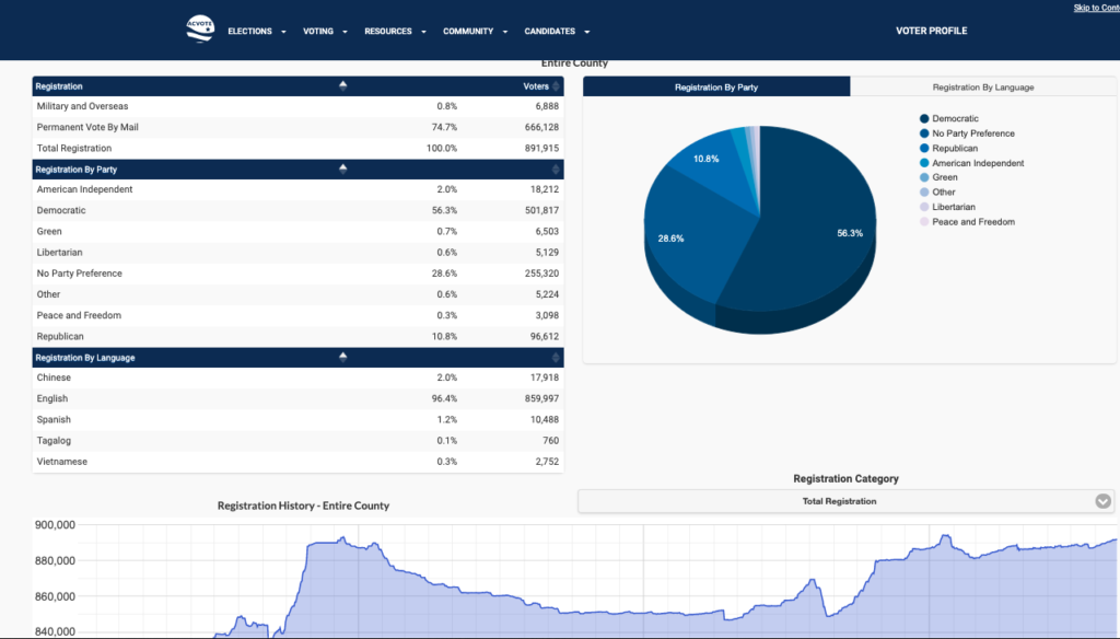
If you need voting stats for small geographic areas like counties or cities, many counties make voter statistics available on their website. For example, the following breakdown by Party and Language that’s on Alameda County’s website.
2. Voter Age Population Demographics: Census’ American Community Survey
Price: Free
Geographies: All US Geographies from large like states & counties to small like zips, Census tracts, & block groups
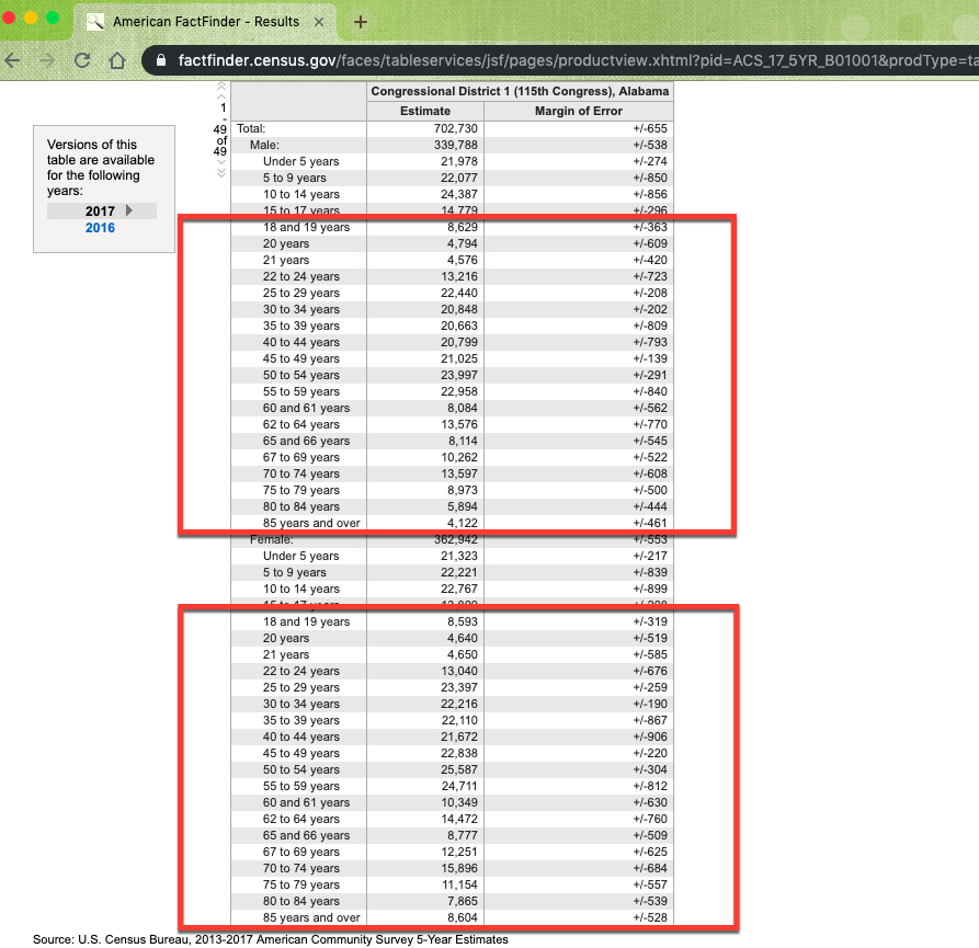
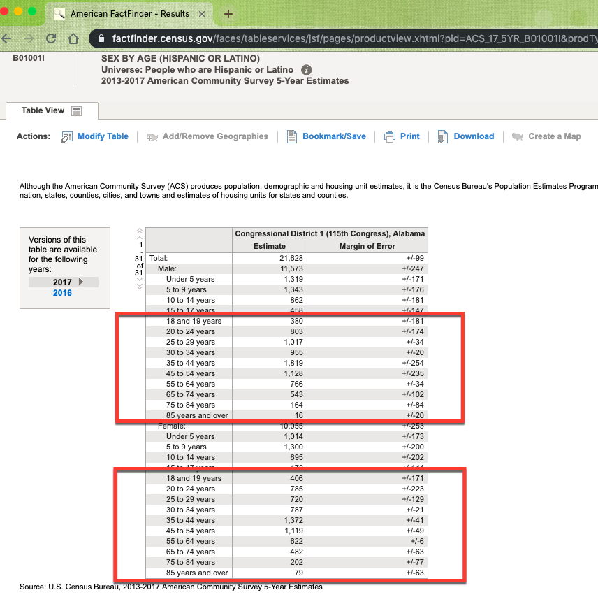
While you can’t get registered voter counts from the Census’ American Community Survey, this dataset has the most current demographics for the voting age population. The most current US Census data is 2017 data, and the 2018 data will be released in December 2019. While you can get American Community Survey demographics for large geographies like congressional districts, you can also get this data for small geographies like zip codes and Census tracts (4,000ish people). These small geographies are particularly helpful if you want to visualize the makeup of a larger geography. You can download this data from census.gov and get the following popular demographics.
Age, Sex, Race/Ethnicity
Example: voting age population by age and sex
Example: voting age population by age, sex and race/ethnicity. In this example, we are displaying Hispanic or Latino but other races & ethnicities are available as well.
Income
Voting age population by income is tricky, because the income categories are for households (not individuals), and because the Census publishes data for householders under 25 (which kind of makes sense if you think about how few 18 years olds are working jobs but under 25 years doesn’t align nicely to voting ages). But you can get income data by age of householder for the following age breakdowns:
Householder under 25 years
Householder 25 to 44 years
Householder 45 to 64 years
Householder 65 years and over
You can get the above data income data by age of householders by race/ethnicity, but I would suggest only getting this data for large geographies like counties because the margins of error will be too large for the small geographies. Below is a sample of income by age of householder data for a county for the first 2 age brackets. You can also get median income rather than a distribution here.
There are thousands and thousands of other data points that can be pulled from the American Community Survey (see 2017 ACS Detailed Table Shells), but the ones listed above (age, sex, race/ethnicity and income) are the most popular for voting demographic projects that we’ve done in the past.
When you overlay the above Census tract demographics on top of voting precinct boundaries in a map, you can identify areas with low voter registration. Sometimes, Census tracts and voting precincts line up, so that you can easily compare the Census’ population estimates with the number of registered voters of a precinct. But even when the voting precincts don’t perfectly align with Census tract, we can help you calculate the percent overlap for precincts and Census tracts to estimate the demographics for the precincts. In the map of Miami-Dade County Voting Precincts and Census tracts below, you can see examples of when Census tracts and precinct align and examples of when the boundaries don’t align.
3. Registered Voters: Census’ Current Population Survey
Price: Free
Geographies: states and metropolitan statistical areas
You can get registered voter data from the US Census using their Current Population Survey dataset. I like to use the Current Population Survey for the total population for cities, counties and states, but you can also use this dataset to get registered voter data for large geographies like metropolitan statistical areas and states. This dataset is the most technically challenging dataset to work with in this list, and here’s what you need to do.
On the top rows, you will see the Technical Documentation and the microdata files (DOS/Windows preferred).
After downloading, to read in the ascii file, you’ll have to write your own program, using the Record Layout given in the Tech Doc.
An alternative to writing your own program. The NBER site does not have the Nov 2018 file, but does have the Nov 2016. You may be able to use the data definition statement file for Nov 2016, as there were no changes to the variables or locations. Certain values, however, did change. To obtain this data definition statement file, go here: https://data.nber.org/data/cps_progs.html then scroll down to Nov 2016 Voting and Registration. Select the software of your choice (SAS, SPSS, Stata). Download the file. This will convert the ascii file to a SAS/SPSS/Stata file.
Variables you will definitely need to work with are: GESTFIPS, GTCBSA, PRTAGE, PRPERTYP, PRCITSHP, PES1, PES2.
Be sure to read these parts of the Tech Doc: Attachments 1, 3, 6, 7, 8.
Main universe for the supplement: PRTAGE = 18+ and PRCITSHP = 1,2,3,4.
Condition for being registered to vote: PES1 = 1 OR PES2 = 1.
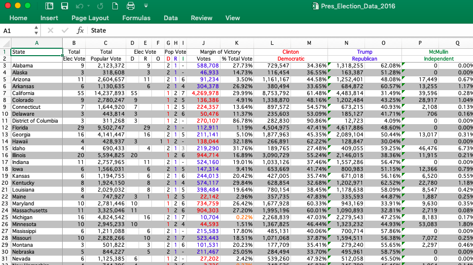
4. Election Results (and County Registration & Turnout data): US Election Atlas
Price: Depends on the dataset, but I tend to
spend at least $200
Geographies: All Counties & Congressional
Districts in the US
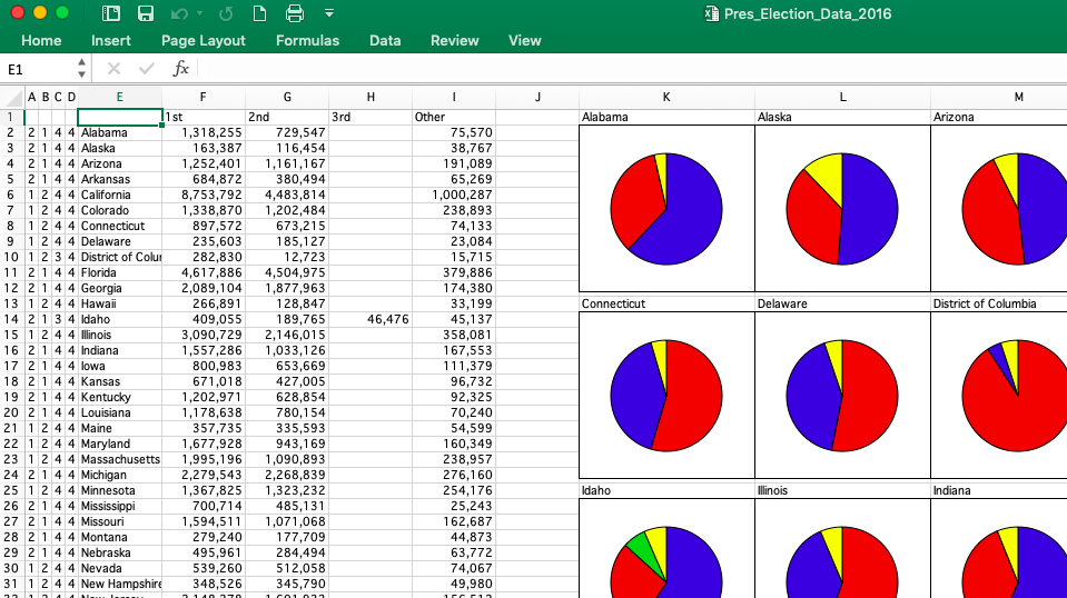
For election results for the entire US, I tend to purchase the 2016 President by County dataset from Dave Leip’s Atlas of US Presidential Elections. Below are some images showing results by state, but county results tend to be more popular. The last time we worked with the Governor Election dataset, there were many states that didn’t have governor election data at the county level.
There’s also voter registration and turnout data by county for the entire US – which sounds interesting, but I haven’t had a chance to work with this data yet. I would like to though. Just waiting for the right project.
5. U.S. Citizen Voting Age Demographics by Age: Social Explorer
Price: Free trial, then $100 a month for individuals
Geographies: states, counties, cities, census tracts, block groups, congressional districts, state legislative districts
Social Explorer is a web application that lets you pull and map certain datasets. I don’t use Social Explorer often, because we have in-house tools and mapping software that are more flexible. BUT they do have a Citizen Voting Age Population Special Tabulation based on the most current US Census’ American Community Survey. You can get data on:
Race
Citizens by Race
Citizenship status
Total Seats in the state
District Size Deviation based on different
bases
Citizen of Voting Age
If you need some of the more popular demographics like voting age population by race or by age and you don’t already know how to pull this data from census.gov, you could sign up for a free trial of Social Explorer to see if it’s the right tool for your project.
6. Custom Data Pull | Cubit
Price: Starts at $599
Geographies: All US Geographies from large geographics like states & counties to small geographies like zips, Census tracts, & block
Whew! Still reading? I’m impressed.
So if you’ve gotten this far and you’re thinking, “Yeah, sure I could pull all of this data myself in a couple of days, but I have other important things to do and I really don’t want to sift through all of the data dictionaries, methodology statements and tool instructions to make sure that I have the most current data for my area of interest,” you are not alone. You sound just like our other clients at Cubit who depend on us to provide clean, accurate and easy-to-work-with data as well as human-to-human customer support. You can get voting data, as well as hundreds of other data points, in a custom data pull. Prices start at $599 with a 3 business day turnaround. Tell me what data you need for what geography & I’ll get you a free quote & turnaround estimate.
Don’t see the voting stats that you are looking for in the post above? Contact me. I have a couple of other sources that either aren’t as popular or change with too much frequency for me to include in this roundup.
Conversely, do you have a favorite voter statistics resource that isn’t on my list? Please let me know so I can share it with others.
Updated: 11/2021. The only time of year that I’m actually happy about traffic is when we get updated traffic data for our reports. Below are 52 of my favorite sources of traffic data that you can use to visualize the AADT or annual average daily traffic that drives past your business (yay!) or past your home (boo!). Let’s start with a table of traffic count data sources from state departments of transportation — DOTs for short.
The DOT datasets above hit the data sleuthing jackpot in that they are free traffic count data sources as well as trustworthy and fairly current. If you have to have 2021 data, skip to the What traffic count data do we use in Cubit’s reports & maps? section below. It can be a bit of pain to incorporate DOT traffic data into your business documents, but it’s nothing that you can’t solve with a good GIS (mapping software) or worst-case scenario, a screen capture tool.
Need traffic counts for the entire US?
DOT traffic count data are by definition just for 1 state, but some projects require multi-state traffic counts. The Federal Highway Administration provides spatial data for traffic counts for the entire US. The last time I emailed them (November 2021), the shapefiles contained 2019 AADT. I really like the FHWA data, but what I hear from my clients is that there’s a huge learning curve to working with shapefiles. So if you aren’t already familiar with shapefiles, consider sticking with the state DOT resources in the table above or working with us at Cubit to build you a custom map with traffic data.
Don’t have time to learn about AADT, GIS, shapefiles, etc.?
I hear you! Sure, you could pull traffic data yourself. Or for $124, you can get a radius report with traffic data. In fact, our clients order more traffic data reports than any other radius report customization – it’s that popular! Since 2009, these same clients outsource these data pulling tasks and research to us at Cubit so they can focus on building their businesses.
What traffic count data do we use in Cubit’s reports & maps?
Unlike most of our demographic data that comes directly from government data sources, we use current (2021) traffic estimates from Kalibrate, a private data vendor, first because:
Kalibrate sources their data from public & private data sources. This means that for certain areas, they have more traffic counts than public data sources alone.
Kalibrate’s data are consistent across states. If you need a radius report in New York City where you want to see traffic counts for both New York and New Jersey, your traffic data will be consistent rather than using 2020 New York data versus 2019 New Jersey data.
Second, if the Kalibrate traffic data doesn’t have enough current traffic counts for a particularly rural area, then we double-check with either the federal dataset or the state DOT datasets (above). So you get the best of both worlds – current data from a private data source supplemented by government data.
Got questions about traffic counts? Email me, because I’m here to help.