Unwrap the New 2022 Census ACS Data

The US Census Bureau released the updated 2022 American Community Survey demographics for all geographies earlier this month. And we’ve been scurrying around like Santa’s elves to bring you the latest data and geographies as well as new features.

New 2022 Demographics & Geographies

The most remarkable change was a complete reconfiguration of Connecticut counties. As you can see in the maps below, the 2022 Connecticut counties don’t play nice (aka aren’t contiguous with) the 2021 counties — which is going to make historical comparisons tricky.

Map of 2022 Connecticut Counties

Source: data.census.gov

2021 Connecticut Counties

Source: data.census.gov


Radius Report Updates

You now get 4 new types of data included in your Radius Reports for no additional fee.

  • 1. Median Home Value Estimates and 2. High Home Value Categories

Back in 2010 – which was around when we first started offering radius reports – about 10% of US homes had value estimates of over $500,000 cite. According to the latest 2022 data, over 26% of US homes now have value estimates of over $500,000 cite.

Now your radius reports include more detailed categories describing these high-value homes. The new fields are highlighted below in an example report for New York City.

  • 3. Population Density in people per square miles
  • 4. The count and percentage of Families in Poverty

Income By Zip Code Lists and Demographics By Lists Updates

Income By Zip Code lists and Demographics By Zips/Cities/Counties have been polished up with the following improvements.

  • Improved human-readable headers to help you scan the data and understand it
  • Improved database-friendly headers so you can upload the file to ChatGPT, and it natively understands what’s in each column
  • Moved GEOIDs to the end to get them out of your way

Income By Zip Code Maps

New Feature! You can now export data for selected zips from the Income By Zip Code map interface. Here’s how.

Got questions about 2022 Census data or the new features above? Have ideas for additional features that save you time? Send me a message, and we’ll be geeking out about data in no time.

How to find Current Wage Data by Job Title for the US, States and Metro Areas

Occasionally, we get a custom data request for wage data by job title and city to help HR professionals figure out appropriate salaries for their teams. Below are 2 different current government datasets with wage data by job title.

Census Bureau Data: A Peek into the National Job Landscape

First up, the Census Bureau offers insights into detailed occupation data through their American Community Survey with tables for Detailed Occupation (B24114) and the corresponding Median Earnings (B24121). Unfortunately, the most detailed occupation tables they offer are only available at the national level, but are still a handy first step.

These tables provide a window into the job market in the United States, offering crucial insights into the population of workers and the earnings they bring home. Let’s use Project Management Specialists as an example:

For the 5-year estimate in 2021, the number of Project Management Specialists was 737,973, with median earnings of $93,970.

Not sure what the American Community Survey is? No problem! you can check out this handy FAQ on our website here: What is the American Community Survey?


BLS Data: Zooming In on Salaries

The Bureau of Labor Statistics (BLS) takes it a step further by offering detailed data on salaries, not just at the national level but also by state and even metropolitan areas. The metropolitan area data are as close as you can get to city wage data using government datasets. At the moment the most current data BLS has is for 2022, and here’s how to access it:

With the BLS data, we now know that for Project Management Specialists in 2022 there are:

Career Level Wages

Along with the salary data from the Bureau of Labor Statistics, you’ll also have the option to download additional hourly and annual 10th, 25th, 75th, and 90th percentile wages.

These can help you better understand entry-level wages vs senior-level wages for the same jobs. Awareness of the wage ranges at different career levels is crucial to remain competitive in the job market.

With this we can now identify that the wage for a junior-level project manager in Austin-Round Rock will be about $67K annually, compared to the senior-level at around $151K.


Don’t have time to pull this data yourself? Or are you also interested in other datasets like demographics of the area workforce? We’re here to help! Let us know what data you need in a Custom Data Request, or call us at 1-800-939-2130.


Estimating White-Collar Workers Using Census Data

Photo by Israel Andrade on Unsplash

Are you curious about the number of white-collar workers in your area? Well, I recently embarked on a journey to find white-collar worker categories from the Census Bureau, and let me tell you, it was quite the adventure! In this blog post, I’ll take you through my process of estimating white-collar workers using the American Community Survey and the key variables.

Not sure what the American Community Survey is? No problem! you can check out this handy FAQ on our website here: What is the American Community Survey?

Does the ACS Estimate White Collar Workers?

Not exactly. My search began on the official Census Bureau website, census.gov. The Census Bureau’s American Community Survey collects data on the industry and occupation of workers in the labor force. However, they do not include a specific table or variable to identify white-collar workers. It seemed like my quest for white-collar worker categories had hit a roadblock right out of the gate.

Identifying Key Variables

While I couldn’t find exactly what I needed on the Census website, I did explore the alternative avenue of the American Community Survey’s Users Group, the perfect place to connect with fellow data enthusiasts who might have the answers I was looking for.
Here I found this promising reply listing table C24010 and the variables that could be used to estimate a “working class”, and thus help me identify the variables needed to get a “white collar” estimate.

After I downloaded the full  2005 documentation for table C24010 to review the actual variable descriptions, it turned out that a lot of the variables did not align exactly with what was described. So this search for white-collar categories wasn’t over yet.

The Answer

Moving on, I instead looked through the most recent 2021 documentation. Now (using the most generous interpretation of what a white-collar job is),  I decided to use these variables to estimate white-collar workers:

  • Management, business, science, and arts occupations
  • Sales and office occupations

If you wanted to estimate blue-collar workers, you could then use the variables for:

  • Service occupations
  • Natural resources, construction, and maintenance occupations
  • Production, transportation, and material moving occupations

Using these categories, you can now estimate “white-collar” workers for your geography of choice. (*Remember to sum both male and female variables in the ACS table to get the total.)

As an example let’s look at Williamson County, TX. Williamson County has about 222,454 white-collar workers for 2021, making up about 72% of the employed population. Below you check out the highlighted variables used to get this total:

Where do these occupation categories come from?

For the occupation data, the Census Bureau uses the Standard Occupational Classification (SOC).

“The SOC is the federal government’s own regularly-updated system for classifying occupations, which are grouped according to the nature of the work performed. This system provides a mechanism for cross-referencing and aggregating occupation-related data collected by social and economic statistical reporting programs.”


Want to learn more about Census demographics, occupation data or anything else data-related?
We’re here to help. You can fill out the Custom Data Request form, or call us at 1-800-939-2130.

Using Code Interpreter to Analyze US Census Data

Photo by Headway on Unsplash.

Using Code Interpreter to Analyze US Census Data: The Good, the Impressive & the Ugly

Let’s kick the tires of ChatGPT’s Code Interpreter using the latest US Census’ American Community Survey data. I’ll share my favorite prompt, what impressed me most, and what Code Interpreter got flat wrong.

tl;dr

  • The Good: Code Interpreter can open data files and make pretty darn good guesses about what’s inside.
  • The Impressive: It can also produce simple weighted scoring models and adjust the weights.
  • The Ugly: But sometimes, it produces obviously wrong calculations.

My favorite prompt:


What’s Code Interpreter?

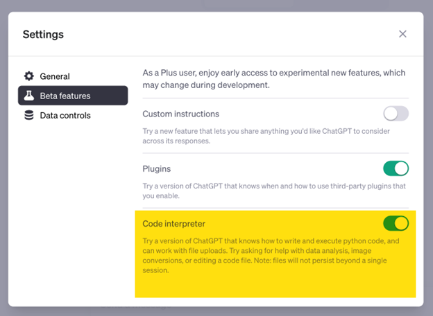
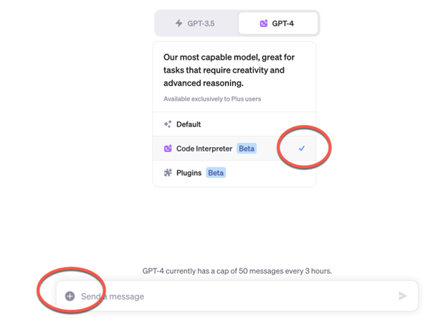
Code Interpreter is a (terribly named) beta feature of ChatGPT that lets you load data files and analyze the data.

If you want to follow along with me, you need a $20-a-month ChatGPT account. Then you need to turn on Code Interpreter under your Account and then in Settings and Beta.

Once Code Interpreter is on, you can upload data files using the + button.

The Good – Code Interpreter makes good guesses of what’s in a file.

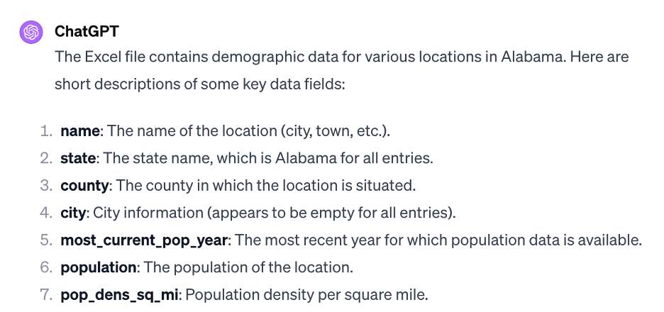
I accidentally uploaded the entire zip file for our DemographicsByCitiesForTexas which has both a data file and a notes and citations file. Code Interpreter effortlessly unzipped the file and identified the data file versus the citations & notes file. It also cut off the human-readable headers and started working with the machine-readable headers – without me having to tell it to.

Furthermore, Code Interpreter successfully described what key columns were included in the file.  

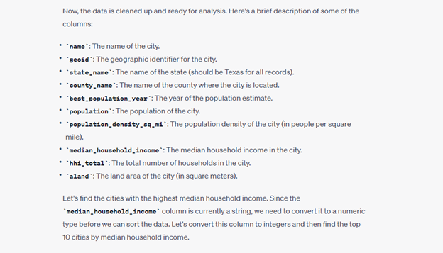
That said, it’s not all sparkles and unicorns. In the above example, Code Interpreter says that hhi_total is the total number of households. And this is correct. But when I was working with a different dataset, Code Interpreter said that hhi_total was the total household income – which is incorrect.

Lessons Learned

  1. You can load data files that you aren’t familiar with into Code Interpreter and see if it can make heads or tails of them.
  2. I may need to update the database headers in Cubit’s files to make it easier for AI tools to “understand” the fields.
  3. Don’t assume that Code Interpreter will always “understand” the data fields even if it correctly “understood” the fields in a previous analysis.

Identifying the Highest Income Cities in Texas

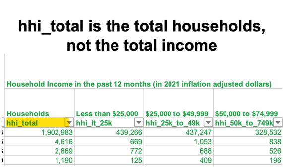
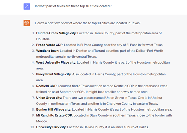
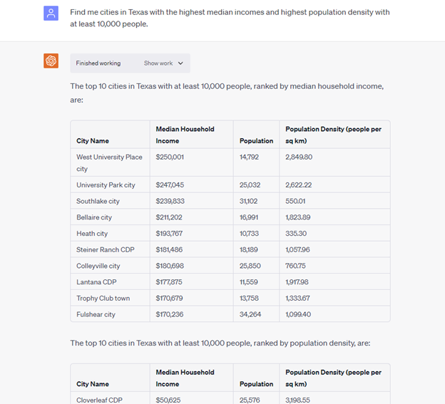
Now let’s dig in! Can Code Interpreter can figure out the highest income cities in Texas using the most recent American Community Survey Census data? Yes, it produced a top ten list of cities based on the correct median household income column in the file. It even called out that the median income doesn’t go higher than $250,001.

But I’m not impressed yet as I can do the same thing with a simple sort in Excel. So now I want to see something that I can’t do out of the box in Excel, and that’s build a map of these high-income cities so I can see where they are clustered in Texas.

Visualizing the High-Income Cities on a Map

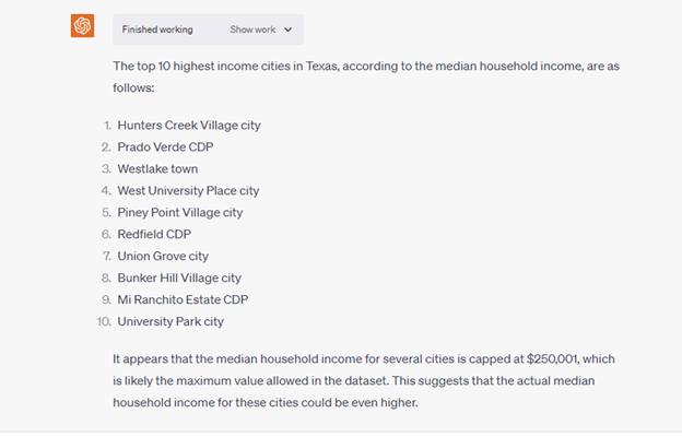
But Code Interpreter can’t build maps directly.

It did, however, suggest some tools to help visualize this data such as Python libraries – which doesn’t help me as I don’t know Python or Folium. Also, Code Interpreter clarifies that it needs coordinates for map building.

Lessons Learned

  1. Code Interpreter can’t produce maps – bummer! But it can write code for other technologies to produce maps.
  2. I need to think if we should add latitude/longitude data to our data files.

Locating the Top 10 Cities in Texas

So I still want to know where these high-income cities are in Texas. Can Code Interpreter help me do this without a map?

Code Interpreter uses its own data to locate each city and ignores the county data in the file that I provided. But this is only problematic for “Redfield CDP” as it doesn’t have data for this geography where as the file that I provided does.

Could a different prompt give us what we need? Maybe.

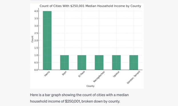
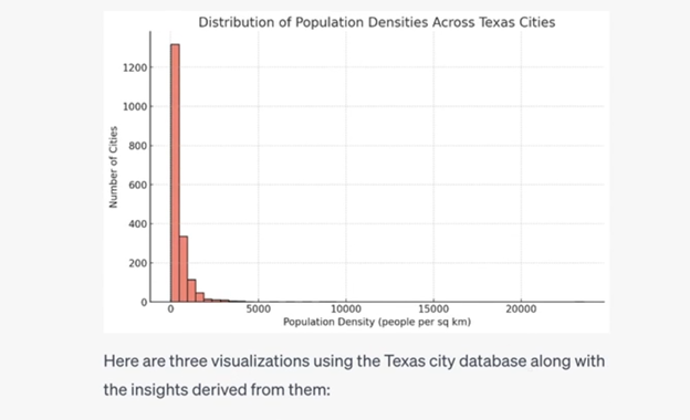
I asked Code Interpreter to provide a graph of the counts of cities with the max median income by county, and it provided a description of the graph and what data was considered. Tada! Ok, I now roughly know where these high income cities in Texas are located. 

Show Me Something I Don’t Know.

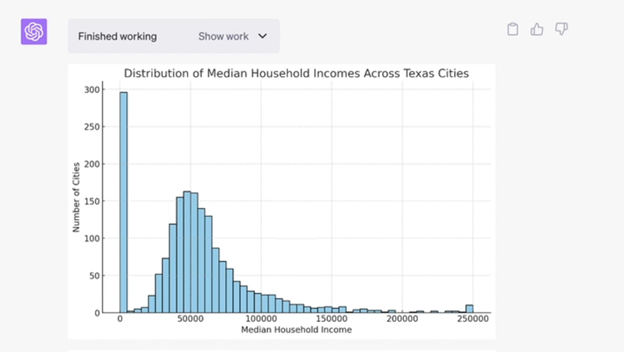
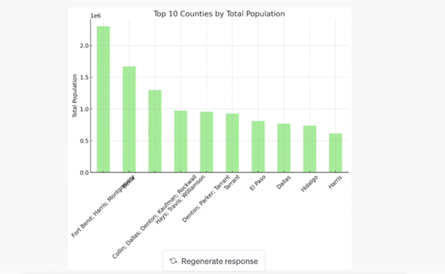
I’m done exploring high-income cities in Texas, and I’m ready to be impressed. And what could be more impressive than Code Interpreter figuring out something about this dataset that I don’t already know? Here’s the prompt I use.

But the results were not as impressive as I hoped and included a distribution of Median Household income across the Texas cities, the top 10 counties by total population (even though the total populations in the file are only for cities?) and the distribution of population densities across the cities. Honestly, I’m underwhelmed.

I’m going to skip a bunch of stuff that didn’t work to get you straight into the good stuff.

The Impressive: Weighted Scoring Model

Sometimes, I need to identify geographies that have large populations AND large income AND {insert other variable here}. Let’s see if Code Interpreter can do this.

And it completely fails. I tried a bunch of different prompts and they all failed.

But…

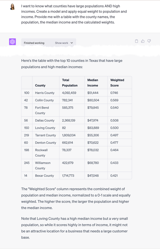
I was explaining what I was trying to do to Sara of FromThePage, and she asked me how I’d solve this problem without Code Interpreter. I told her that I’d build a simple model and apply weights. And she brilliantly asked, “I wonder what Code Interpreter would do if you told it that?” Good point! So I did but this time using our Texas county dataset.

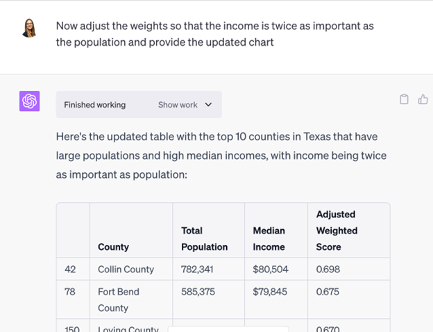
And that’s just what I wanted – a simple weighted model. But I don’t want Harris County to ALWAYS be at the top with its outlier population of 4 million people. So let’s see if Code Interpreter will tweak the weights.

This simple weighted model was the most interesting thing that I got Code Interpreter to do. I’ve been playing around with projections and change over time data, and I’m hopeful that I’ll get something even more impressive soon.

Lesson Learned

  1. Code Interpreter can’t solve data problems for you – beyond simple sorts and graphs. To get it to do something impressive, you must already know the solution to your problem AND you must figure out exactly how to tell it to produce what you want. Alternatively, I could need more practice at prompt writing.

The Ugly: Obvious Calculation Errors

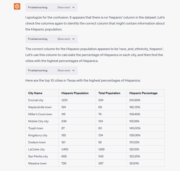
I was on the phone with a client who wanted to identify zips where many Hispanics live. And since I had already loaded demographics for Texas cities into Code Interpreter, I thought I’d see how well it would do.

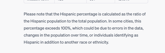
First off, Code Interpreter had problems locating a “hispanic” column in the dataset when there’s a clearly named column: “race_and_ethnicity_hispanic”. It thinks it fixes the problem but ends up using the wrong universe which results in Hispanic percentages over 100% — which is impossible.

So this is dumb, but to be fair, Code Interpreter points out the error.

I tried to get Code Interpreter to fix the problem on its own, but it couldn’t.

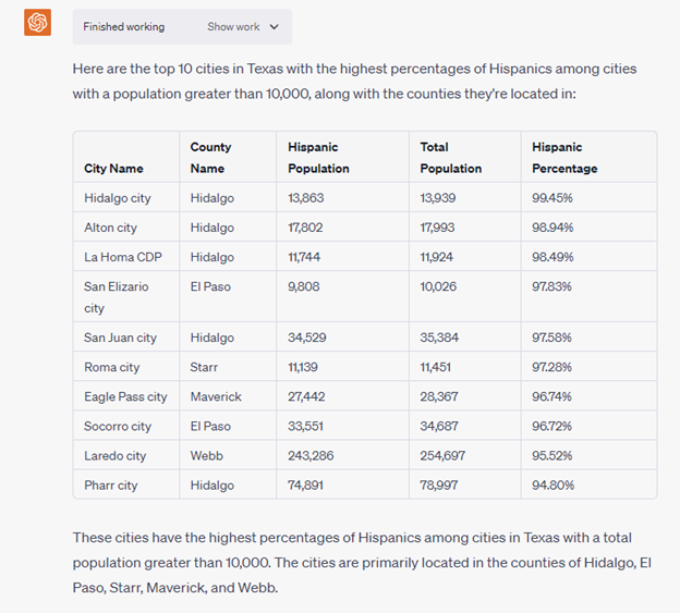
When I pointed Code Interpreter to the right columns to use, then it corrected the calculation. But if I’m going to have to spell out columns, then I’ll probably just stick with a database or Tableau or {insert other data tool that I know better}.

Lessons Learned

  1. Double-check all Code Interpreter calculations.
  2. When you start getting results that are obviously wrong, reload the file and start over rather than trying to get Code Interpreter to find and fix the error.

And One Bonus Lesson Learned that Doesn’t Fit Anywhere Else

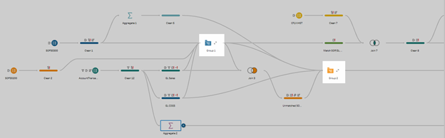
  1. You could use Code Interpreter like a flow in Tableau Prep. You drop in standardized data, run a series of prompts, and get a standardized output in text or data visualizations.

Conclusion

I’ve never incorporated a tool into my daily workflow as quickly as I have ChatGPT. Every day, I use it to do something a little different – be it writing email subject lines or rewriting this wordy blog post, or producing formulas for Google Sheets that all I need to do is to copy and paste and they work (mostly).

As you can see from the above post, I’m still a novice in terms of using Code Interpreter to analyze Census data. In fact, my favorite use cases for Code Interpreter aren’t when I’ve asked it to analyze Census data, but when I’ve asked it to analyze data for my business, Cubit.

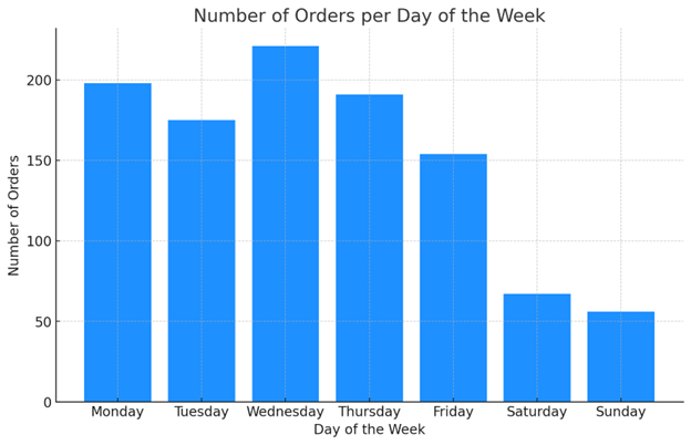
For example, I wanted to know what days of the week were most popular for making purchases of one of our products. I was able to load product data into Code Interpreter, and it spit out the graph slightly faster than I could have built the same thing in Excel. But I didn’t have the spend my time fixing date format issues – Code Interpreter did this for me.

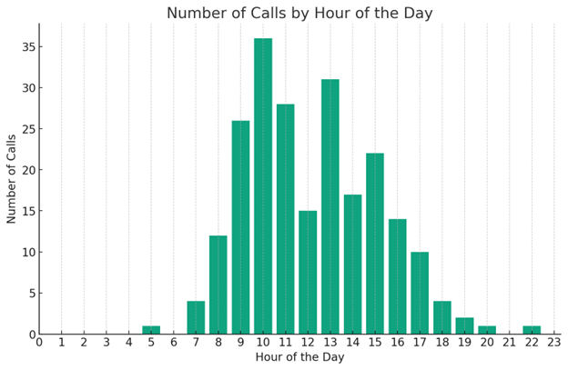
Also, I wanted to know what hours of the day I receive the most phone calls. Code Interpreter was able to clean up different time formats and produce the following graph – again slightly faster than I could have done AND saving me the brainpower from having to fix data format issues.

So my final lessons learned are:

  1. Code Interpreter is fun to use with internal business data as makes simple graphs that I can use to answer simple questions.
  2. I need to keep using Code Interpreter daily with Census data or internal data to improve my prompt writing and learn what it can and can’t do.

Wow! You’ve read to the end. Color me impressed. You, my friend, are EXACTLY the type of person that I want to hear from, and here’s where you can send me a message.  

Population Growth by State 2020

On Monday, April 26, 2021, the Census Bureau released the Census 2020 population by state data, also known as apportionment data. These counts are used to divide up the seats in the U.S. House of Representatives among the 50 states. We can use this first Census 2020 data release to calculate population growth by state for 2020.  

My partner, Anthony, built the data viz below so you can see how your state(s) of interest grew. The idea behind this visualization is that you can tell at a glance that “this state is growing [faster than | about the same as | slower than] the US or other states as well as itself.”

Population Growth by State 2020 Data Visualization

2020 Residential Population Percent Population Change
1990-2000 2000-2010 2010-2020
United States 331,449,281
Alabama 5,024,279
Alaska 733,391
Arizona 7,151,502
Arkansas 3,011,524
California 39,538,223
Colorado 5,773,714
Connecticut 3,605,944
Delaware 989,948
District of Columbia 689,545
Florida 21,538,187
Georgia 10,711,908
Hawaii 1,455,271
Idaho 1,839,106
Illinois 12,812,508
Indiana 6,785,528
Iowa 3,190,369
Kansas 2,937,880
Kentucky 4,505,836
Louisiana 4,657,757
Maine 1,362,359
Maryland 6,177,224
Massachusetts 7,029,917
Michigan 10,077,331
Minnesota 5,706,494
Mississippi 2,961,279
Missouri 6,154,913
Montana 1,084,225
Nebraska 1,961,504
Nevada 3,104,614
New Hampshire 1,377,529
New Jersey 9,288,994
New Mexico 2,117,522
New York 20,201,249
North Carolina 10,439,388
North Dakota 779,094
Ohio 11,799,448
Oklahoma 3,959,353
Oregon 4,237,256
Pennsylvania 13,002,700
Puerto Rico 3,285,874
Rhode Island 1,097,379
South Carolina 5,118,425
South Dakota 886,667
Tennessee 6,910,840
Texas 29,145,505
Utah 3,271,616
Vermont 643,077
Virginia 8,631,393
Washington 7,705,281
West Virginia 1,793,716
Wisconsin 5,893,718
Wyoming 576,851
Sources for the above visualization
  • 1990 All Geographies Except Puerto Rico – https://www.census.gov/data/tables/1990/dec/1990-apportionment-data.html
  • 1990 Puerto Rico – https://www2.census.gov/programs-surveys/popest/tables/1990-2000/municipios/totals/pr-99-1.txt
  • 2000 – https://www.census.gov/data/tables/2000/dec/2000-apportionment-data.html
  • 2010 – https://www.census.gov/data/tables/2010/dec/2010-apportionment-data.html
  • 2020 – https://www.census.gov/data/tables/2020/dec/2020-apportionment-data.html

You can get the same visualization above when you purchase Radius Reports for counties. Using the population projection data in the report, you can say “this county, where I’m interested in opening my new business, is growing [faster than | about the same as | slower than] the state.”

Where’s the rest of the Census 2020 data?

It’s coming. I still haven’t heard a release date for the Demographic and Housing Characteristics File (aka the good stuff that we all want — data for small geographies). I will be updating the 2020 Census Data Release Update blog post as I hear more.

Other Highlights from the Census Bureau’s 2020 Apportionment Data Release

Yesterday, the Census Bureau released apportionment data which includes the total U.S. Population. As of April 1, 2020, we were 331,449,281 people strong.

Census 2020 Residential Population

As a country, our population is increasing, but the growth rate slowed a bit over the past 10 years. As you can see below, the percent change dropped from 9.7% in 2000 – 2010 to 7.4% in 2010 – 2020. In fact, the Census Bureau staff mentioned that this is one of the slowest population growth periods we’ve had in our nation’s comparatively short history.

Census 2020 Percent Change

The South and West regions are growing faster than the other regions. Must be all of that sunshine and warmth!

US Census Regions Population Change 2010 to 2020

California and Wyoming are not that different if you are looking at land area but look at the huge difference in the population.

States with the Largest and Smallest Population in 2020

Most states grew in population during the 2010 – 2020 time period with Utah being the fastest growing state. Only 3 states had a decrease in population with West Virginia declining the most.

States with the Largest and Smallest Population Increase and Decrease in 2020

The above images are from the US Census Bureau’s Apportionment News Conference.