From Wool to Wealth: Books As Data

I used to receive an awesome email newsletter from Trends.vc that would interview an entrepreneur and ask what they were reading. I haven’t received these emails recently, and I’m missing getting reading recommendations from fellow small business owners.

I’m taking a break from writing about the latest in the world of data and instead offering the 10 best non-fiction books that I’ve read over the past 6 months* in case you, too, are looking for a new book to read.

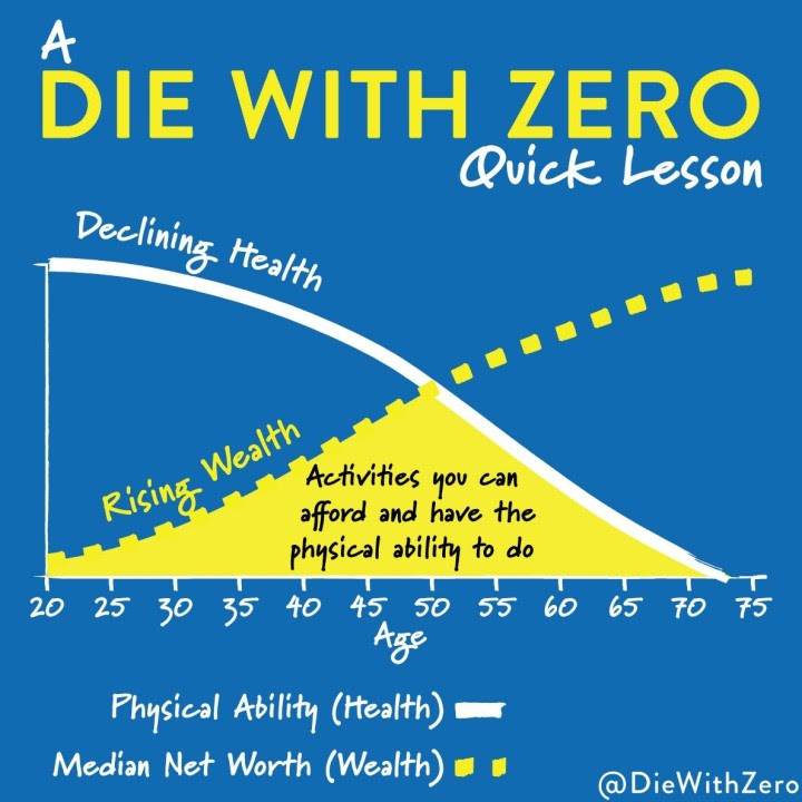
If you only have time to read 1 book, read Die with Zero: Getting All You Can from Your Money and Your Life by Bill Perkins. This book encourages a shift from saving money for retirement to designing a life full of experiences, acknowledging that certain adventures are a better fit for certain ages. It’s a book about how to live a rich life rather than how to be rich.

Goodreads Stats

If Die with Zero doesn’t speak to you, here are 9 more 5-star non-fiction books according to me.

  1. Hidden Potential: The Science of Achieving Greater Things by Adam Grant – A roadmap for how to configure scaffolding for people and organizations to reach…you guessed it…their hidden potential.
  2. Unraveling: What I Learned About Life While Shearing Sheep, Dyeing Wool, and Making the World’s Ugliest Sweater by Peggy Orenstein – One of my favorite writers journeys into the world of wool as her daughter leaves for college and the world retreats during the pandemic. I don’t care about wool or knitting, but I’ll read anything Peggy Orenstein writes.
  3. Going Infinite: The Rise and Fall of a New Tycoon by Michael Lewis – The rise and fall of Sam Bankman-Fried, crypo-king, from the author’s unique perspective embedded within FTX. Lewis is the only author I’d trust to make the shadowy crypto world both understandable and entertaining.
  4. Exercised: Why Something We Never Evolved to Do Is Healthy and Rewarding by Daniel E. Lieberman – A fun explaination as to why I STILL don’t want to work out even though I feel much better afterwards.
  5. In Search of Sleep: An Insomniac’s Quest to Understand the Science, Psychology, and Culture of Sleeplessness by Bregje Hofstede, Alice Tetley-Paul (Translator) – The science, psychology, and culture surrounding sleeplessness written by an educated lay-person. Having read many doctor-written books on insomnia, this fellow sufferer was able to offer compassion and understanding, if not a workable solution as I won’t be uprooting my family to rural France.
  6. Made to Stick: Why Some Ideas Survive and Others Die by Chip Heath, Dan Heath – Offers a formula for how to create messages that are memorable and impactful.
  7. Crying in H Mart by Michelle Zauner – A memoir of a Korean-American daughter grieving the loss of her mother through their shared love of food. I cried so much through this one, you guys, so much.
  8. The Happiness Hypothesis: Finding Modern Truth in Ancient Wisdom by Jonathan Haidt – Journey through ancient wisdom and modern psychology to add more happiness to your life today. I normally a fan of pop psychology books, but this one was just the right mix of storytelling and reasonable advice.
  9. Same as Ever: A Guide to What Never Changes by Morgan House – Who also wrote the blockbuster Psychology of Money. What I like about his new book is that while many of the things that stay the same apply to financial markets, they also are applicable for other important areas of life — like building a business, parenting or staying sane in rapidly changing world. 

Got a book recommendation for me? Send me a message and let me know. I’ve still got room on my giant pile of books to read. 


* P.S. “Wait? Whaaaaaat? You’ve read more than 10 non-fiction books in 6 months.” Don’t you have…like…two kids…and a business to run…and 4 soccer teams to play on?

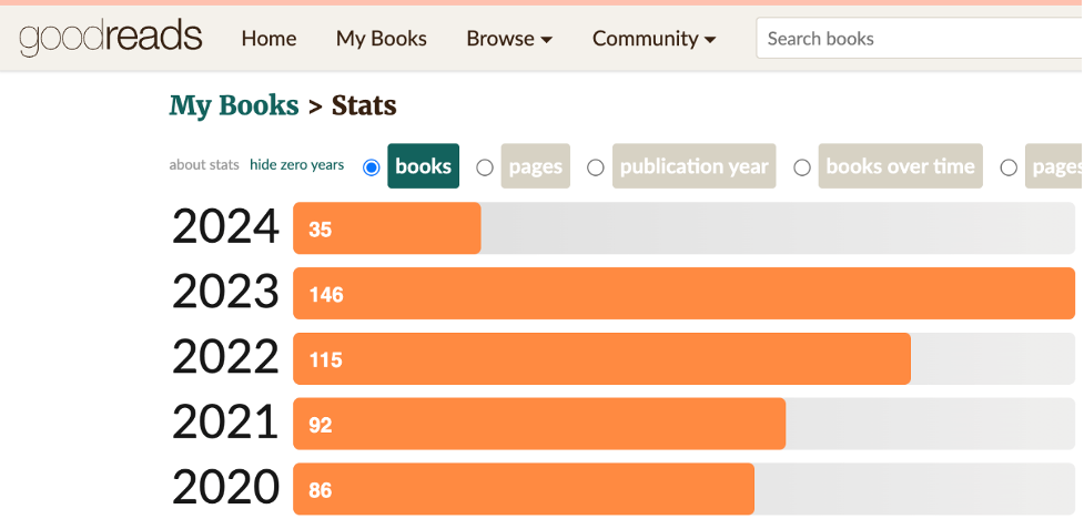
Yes, yes, and yes. Goodreads says I read around 100 books a year, but that includes kids books and books I quit because they didn’t speak to me. 

Goodreads Stats

If you caught my nod to insomnia in the description of In Search of Sleep above, I’m sensitive to TV and movies before bed. So after I read with my kids, I read my back-lit Kindle Oasis for until I get sleepy. When I wake up in the middle of the night, I read myself back to sleep. And when I wake up at 4 am, I usually read before starting work.

Non-fiction books work well for this reading as I can get sucked into page turning fiction stories and stay up too late reading…the opposite of what I’m going for. Also like older fiction books like George Elliot’s Middlemarch (which I’m also reading now) work well for this type of reading too.

A couple other reading hints…

  • I check out books to read on my Kindle for free from my AMAZING Austin public library.
  • Goodreads syncs with my Kindle to produce rough tracking like the graph above and a list of what I’m read.
  • And Readwise syncs my Kindle highlights (you can highlight passages that speak to you in a Kindle) and emails me 10 highlights a day, helping me remember what I’ve read. 

Crunch: Housing Cost Affordability for US Metro Areas

Are you aware of how housing costs impact your customers’ spending habits? Understanding the financial burdens of your customers can help you tailor your marketing and sales strategies. For instance, in states like Florida, Nevada, and California, a higher percentage of renters are housing-burdened, which impacts their discretionary spending.

The Definition

The Department of Housing and Urban Development considers those who pay more than 30% of their income on housing to be “housing-burdened.”

Renters vs. Homeowners: Who’s More Burdened by Housing Costs?

It turns out, over half of the renters in the US are shouldering a significant housing cost burden. In 2022, a staggering 52% of renters and 23% of homeowners spent more than 30% of their income on housing (source: US Census). While these figures have fluctuated over the past decade, they remain high.

Prices of Homes Rising.

Nationally, the cost of homes has soared by 74% from 2010 to 2022, outpacing wage growth which saw a 54% increase (sources: Bureau of Labor Statistics, Federal Housing Finance Agency). This widening gap can significantly impact consumer spending power.  

Because of this trend in rising home prices, we recently added more high value categories to our radius reports. The example below is a location in New York City.

Let’s go Low, Low, Low, Low, Low, Low, Low, Low

While I love USAFacts’ analysis of housing burden by state and tenure, state geographies are usually too large for most business owners to use in their decision-making. So let’s look at similar data for metro areas.

List of Metro areas sorted by housing burdened owners

You can download this Google Sheet to sort and filter for your markets by going here: https://docs.google.com/spreadsheets/d/1dbOFaxboBGYtMqbqoERqvtbWy_4Cs8ZJYgKye1IdaQY/edit#gid=0 Then click on File/Download.

Most housing burdened markets for owners with mortgages

The 2022 American Community Survey data presented lists the percentage of housing units with a mortgage that cost the owner 30% or more of their income in various U.S. metropolitan areas. Two areas tie for the highest percentage, Kahului-Wailuku-Lahaina in Hawaii and Aguadilla-Isabela in Puerto Rico, both at 43.7%. The Yauco metro area in Puerto Rico follows at 41.6%, and the Los Angeles-Long Beach-Anaheim area in California is close behind at 41.5%.

The data suggests that homeowners in these regions are likely to spend a significant portion of their income on housing costs, which can be indicative of high housing prices, low incomes, or a combination of both. Notably, three of the top five areas with the highest owner costs are in Puerto Rico, highlighting a potential regional pattern of housing affordability challenges.

Most housing burdened markets for renters

  1. High Rental Cost Burden: All the listed MSAs have more than half of their renters spending over 30% of their income on rent, indicating a high rental cost burden in these areas. This suggests that affordability is a significant issue for renters in these regions.
  2. Florida's Rental Market: Florida appears prominently on this list, with four MSAs featured: Gainesville, Punta Gorda, The Villages, and Naples-Marco Island, with Miami-Fort Lauderdale-Pompano Beach having the highest percentage at 62.6%. This points towards a statewide trend of high rental costs relative to income in Florida.
  3. Diversity of Locations: The MSAs are geographically diverse, covering various parts of the country including the East Coast, West Coast, and the Mountain States. However, there is a noticeable cluster in the state of Florida, suggesting regional market dynamics that affect rental affordability.
  4. College Towns: Several of the MSAs listed, like Gainesville, FL (University of Florida), Boulder, CO (University of Colorado), and Ithaca, NY (Cornell University), are known as college towns. This could imply that the presence of a large student population may drive up rental prices due to demand, possibly impacting the affordability for non-student renters as well.
  5. Variation in Cost Burden: While the percentage of renters experiencing a high cost burden is significant in all these MSAs, there is a noticeable variation, with Gainesville at the lower end (58.7%) and Miami-Fort Lauderdale at the higher end (62.6%). This variation might reflect differences in local economies, housing supply constraints, and demographic pressures.

Need housing burden data for smaller geographies than MSAs?

We can help. You can request this data as your 1 free table add on when you purchase a spreadsheet report. Or for $100, you can get a custom manual calculation added to your radius report.

Got more questions about housing burden data? Send me a message, and we’ll be talking about data in no time.

Sources: 

Bureau of Labor Statistics

Federal Housing Finance Agency

US Census Bureau

Unwrap the New 2022 Census ACS Data

The US Census Bureau released the updated 2022 American Community Survey demographics for all geographies earlier this month. And we’ve been scurrying around like Santa’s elves to bring you the latest data and geographies as well as new features.

New 2022 Demographics & Geographies

The most remarkable change was a complete reconfiguration of Connecticut counties. As you can see in the maps below, the 2022 Connecticut counties don’t play nice (aka aren’t contiguous with) the 2021 counties — which is going to make historical comparisons tricky.

Map of 2022 Connecticut Counties

Source: data.census.gov

2021 Connecticut Counties

Source: data.census.gov


Radius Report Updates

You now get 4 new types of data included in your Radius Reports for no additional fee.

  • 1. Median Home Value Estimates and 2. High Home Value Categories

Back in 2010 – which was around when we first started offering radius reports – about 10% of US homes had value estimates of over $500,000 cite. According to the latest 2022 data, over 26% of US homes now have value estimates of over $500,000 cite.

Now your radius reports include more detailed categories describing these high-value homes. The new fields are highlighted below in an example report for New York City.

  • 3. Population Density in people per square miles
  • 4. The count and percentage of Families in Poverty

Income By Zip Code Lists and Demographics By Lists Updates

Income By Zip Code lists and Demographics By Zips/Cities/Counties have been polished up with the following improvements.

  • Improved human-readable headers to help you scan the data and understand it
  • Improved database-friendly headers so you can upload the file to ChatGPT, and it natively understands what’s in each column
  • Moved GEOIDs to the end to get them out of your way

Income By Zip Code Maps

New Feature! You can now export data for selected zips from the Income By Zip Code map interface. Here’s how.

Got questions about 2022 Census data or the new features above? Have ideas for additional features that save you time? Send me a message, and we’ll be geeking out about data in no time.

How to find Current Wage Data by Job Title for the US, States and Metro Areas

Occasionally, we get a custom data request for wage data by job title and city to help HR professionals figure out appropriate salaries for their teams. Below are 2 different current government datasets with wage data by job title.

Census Bureau Data: A Peek into the National Job Landscape

First up, the Census Bureau offers insights into detailed occupation data through their American Community Survey with tables for Detailed Occupation (B24114) and the corresponding Median Earnings (B24121). Unfortunately, the most detailed occupation tables they offer are only available at the national level, but are still a handy first step.

These tables provide a window into the job market in the United States, offering crucial insights into the population of workers and the earnings they bring home. Let’s use Project Management Specialists as an example:

For the 5-year estimate in 2021, the number of Project Management Specialists was 737,973, with median earnings of $93,970.

Not sure what the American Community Survey is? No problem! you can check out this handy FAQ on our website here: What is the American Community Survey?


BLS Data: Zooming In on Salaries

The Bureau of Labor Statistics (BLS) takes it a step further by offering detailed data on salaries, not just at the national level but also by state and even metropolitan areas. The metropolitan area data are as close as you can get to city wage data using government datasets. At the moment the most current data BLS has is for 2022, and here’s how to access it:

With the BLS data, we now know that for Project Management Specialists in 2022 there are:

Career Level Wages

Along with the salary data from the Bureau of Labor Statistics, you’ll also have the option to download additional hourly and annual 10th, 25th, 75th, and 90th percentile wages.

These can help you better understand entry-level wages vs senior-level wages for the same jobs. Awareness of the wage ranges at different career levels is crucial to remain competitive in the job market.

With this we can now identify that the wage for a junior-level project manager in Austin-Round Rock will be about $67K annually, compared to the senior-level at around $151K.


Don’t have time to pull this data yourself? Or are you also interested in other datasets like demographics of the area workforce? We’re here to help! Let us know what data you need in a Custom Data Request, or call us at 1-800-939-2130.


Estimating White-Collar Workers Using Census Data

Photo by Israel Andrade on Unsplash

Are you curious about the number of white-collar workers in your area? Well, I recently embarked on a journey to find white-collar worker categories from the Census Bureau, and let me tell you, it was quite the adventure! In this blog post, I’ll take you through my process of estimating white-collar workers using the American Community Survey and the key variables.

Not sure what the American Community Survey is? No problem! you can check out this handy FAQ on our website here: What is the American Community Survey?

Does the ACS Estimate White Collar Workers?

Not exactly. My search began on the official Census Bureau website, census.gov. The Census Bureau’s American Community Survey collects data on the industry and occupation of workers in the labor force. However, they do not include a specific table or variable to identify white-collar workers. It seemed like my quest for white-collar worker categories had hit a roadblock right out of the gate.

Identifying Key Variables

While I couldn’t find exactly what I needed on the Census website, I did explore the alternative avenue of the American Community Survey’s Users Group, the perfect place to connect with fellow data enthusiasts who might have the answers I was looking for.
Here I found this promising reply listing table C24010 and the variables that could be used to estimate a “working class”, and thus help me identify the variables needed to get a “white collar” estimate.

After I downloaded the full  2005 documentation for table C24010 to review the actual variable descriptions, it turned out that a lot of the variables did not align exactly with what was described. So this search for white-collar categories wasn’t over yet.

The Answer

Moving on, I instead looked through the most recent 2021 documentation. Now (using the most generous interpretation of what a white-collar job is),  I decided to use these variables to estimate white-collar workers:

  • Management, business, science, and arts occupations
  • Sales and office occupations

If you wanted to estimate blue-collar workers, you could then use the variables for:

  • Service occupations
  • Natural resources, construction, and maintenance occupations
  • Production, transportation, and material moving occupations

Using these categories, you can now estimate “white-collar” workers for your geography of choice. (*Remember to sum both male and female variables in the ACS table to get the total.)

As an example let’s look at Williamson County, TX. Williamson County has about 222,454 white-collar workers for 2021, making up about 72% of the employed population. Below you check out the highlighted variables used to get this total:

Where do these occupation categories come from?

For the occupation data, the Census Bureau uses the Standard Occupational Classification (SOC).

“The SOC is the federal government’s own regularly-updated system for classifying occupations, which are grouped according to the nature of the work performed. This system provides a mechanism for cross-referencing and aggregating occupation-related data collected by social and economic statistical reporting programs.”


Want to learn more about Census demographics, occupation data or anything else data-related?
We’re here to help. You can fill out the Custom Data Request form, or call us at 1-800-939-2130.