How AI Hurt My Marketing (and a New Tool to Try)

A New Tool to Try for Population in a Radius Estimates

TL;DR: Get instant, free population by radius estimates using the most current data from Census.gov. No account or login required. After you kick the tires, let me know what you think!

Click here for our new Population in a Radius Tool

How AI Hurt My Small Business’ Marketing

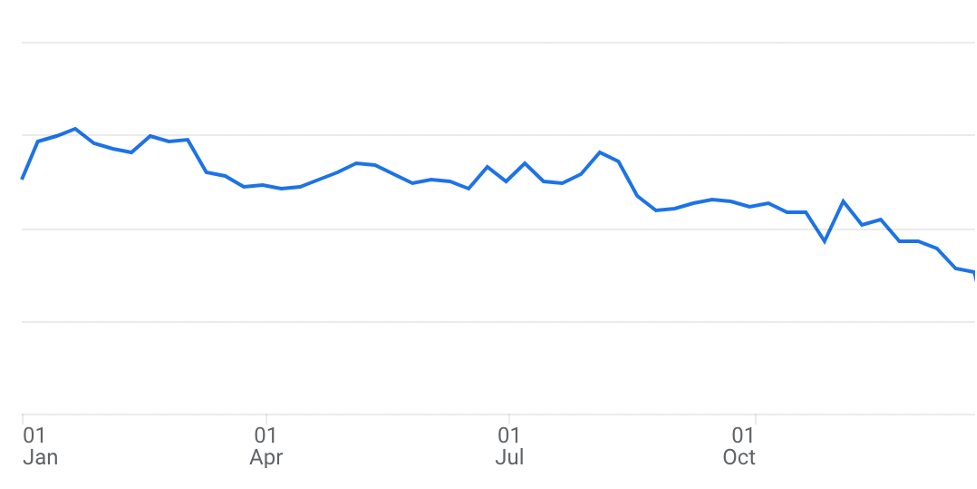
Last week, I saw a graph showing how HubSpot’s website traffic plummeted due to changes in Google searches. My traffic graph (below) from last year shows the same decline.

If mighty HubSpot and my small business are both struggling with this shift… well, I imagine lots of other businesses are, too. Google’s AI Overviews are changing SEO content opportunities. So, what’s a business owner to do?

🔬 Experiment

One experiment that added more traffic for us last year was adding current-year population projections to our website (read more here).

This year, we’re testing “engineering as marketing”, which means building free, simple tools that solve problems and attract traffic. When you need quick estimates of the population in a radius, you can pull this data instantly using our new 👉 Population in a Radius Tool, which uses the same trusted methodology as our $74 radius reports.

🗣 I’m excited to hear what you think and to see if this tool leads to new visitors to our website.

🚀 So What’s the Next Marketing Play for Your Business?

As I rethink traffic strategies for the post-AI landscape, I’ve revisited one of my favorite marketing books, Traction. Its list of channels might spark some ideas for your next marketing test.

💬 If you have feedback on the tool or want to talk about demographics or marketing channels, send us an email to datanerds@cubitplanning.com, or fill out the Custom Data Request form — I’m happy to help!

Current Census Demographics by DMA

Photo by Chris Lawton on Unsplash

Once in a blue moon, I get a custom data request to use the most current US Census data to produce estimates for Nielsen’s designated market areas or DMAs.

If you can buy data from Nielsen, you should, because they are the only definitive source for DMAs. That said, I’ve tried to purchase data from Nielsen multiple times and they’ve never called or emailed me back. So if you can’t get Nielsen to call you back, you can use the following process.

Nielsen defines “a DMA region is a group of counties that form an exclusive geographic area in which the home market television stations hold a dominance of total hours viewed.”

Given that DMAs are groups of counties and the US Census Bureau publishes estimates for counties, then all you have to do is:

  1. Identify the counties that make up the DMA;
  2. Pull the most current Census demographics for those counties;
    &
  3. Sum up the estimates.

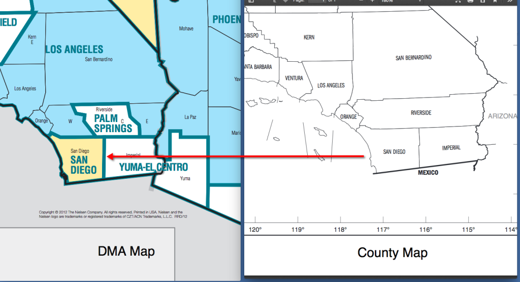
Easy peasey, right? There are 12 DMAs that split counties. See the map below for 2 examples of DMAs that split counties.

List of DMAs that Split Counties

Oneida CountyUtica
Syracuse
Lea CountyOdessa-Midland
Albuquerque-Santa Fe
Apache CountyPhoenix
Albuquerque-Santa Fe
Kern CountyBakersfield
Los Angeles
Riverside CountyLos Angeles
Palm Springs
Solano CountySan Francisco- Oakland – San Jose
Sacramento – Stockton – Modesto
El Dorado CountyReno
Sacramento – Stockton – Modesto
Western Connecticut Planning RegionNew York
Hartford & New Haven
Last Updated: January 9, 2025

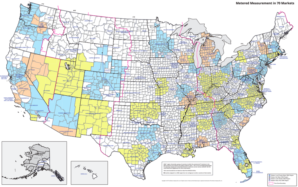
So if you don’t need data for these problem DMAs, you can google search for a mapping of DMAs to counties (like this one). Then you can pull the most current Census data from census.gov (or we sell the most popular demographic data points for all US counties for $199 as an instant download here) and then use a handy SUMIF function in Excel to produce your estimates.

But if you need demographics for all DMAs or at least 1 DMA that splits counties, here’s how you can handle these problem geographies.

1. Produce a shapefile with DMA Boundaries

For the 199 DMAs that play nice with county boundaries

 A. Start with these boundaries: https://github.com/simzou/nielsen-dma

 B. Fix Rochester, MN and Rochester, NY (which are swapped) and created boundaries for Anchorage, AK, Juneau, AK, Fairbanks, AK and Honolulu, HI (which were missing).

 C. Doublecheck your work using Nielsen documentation and make any needed corrections.

The 11 DMAs that split counties

  1. In the file that you’ve created above, swap the boundaries for these 11 DMAs listed in this blog post above with the boundaries in the 2008 shapefile provided by Harvard here.
  2. Doublecheck your work using Nielsen documentation and make any needed corrections.

2. Intersections with Census geographies.

Now that you have a DMA spatial file that you are happy with, run intersections with Census geographies.

  1. For the 199 DMAs that play nice with counties, produce a county to DMA list.
  2. For the 11 DMAs that split counties, run intersections between the DMA and Census tracts and calculate the area percent overlap. Census tracts generally have a population size between 1,200 and 8,000 people, with an optimum size of 4,000 people.

 3. Estimating Demographics

  1. For the 199 DMAs that play nice with counties, sum the county estimates.
  2. For the 11 DMAs that split counties, multiply the Census tract estimates by the percent overlap. If 10% of the area of a Census tract is in the Reno DMA, then assign 10% of the population in that Census tract to the Reno DMA. Thoughts: there are more accurate ways to solve this, but this one works pretty well for the level of effort involved.
  3. You can use this formula for median calculations like median income or median age.

4. QA

  1. Compared your results to Nielsen’s data. For example, New York, Los Angeles, & Chicago are the DMAs with the largest populations. Are your 3 largest DMAs also New York, Los Angeles & Chicago?
  2. Consider calculating a percent difference between Nielsen’s Metro age 12+ population for 2019 and the Census Bureau’s 2018 age 10+ population. This percent difference would show you if any of your estimates are off.

Want to geek out more about Census demographics or DMAs or anything else data related?

Either fill out the Custom Data Request form or call me, Kristen, at 1-800-939-2130.

Unwrap the New 2022 Census ACS Data Now

The 2023 American Community Survey (ACS) 5-year data are here, and we’ve been busy as Santa’s elves getting the latest updates ready for you!

You can now access the freshly updated 2023 Census demographics in:

Starting in January, we will update your Custom Data Pulls and Interactive Maps with the new data. And if you’ve purchased an Income by Zip Code List, Map, or Demographics By Report since November 8, we’ll start emailing your updated reports with 2023 data for no additional charge in early January. 

What’s New in This Year’s ACS?

  • Housing Costs by Race
    This new table shows what percentage of income goes toward housing for renters, homeowners with a mortgage, and those without one by race. See example.
  • Homeowners Insurance Costs
    You can see how much homeowners spend on insurance, whether they’ve paid off their mortgage or not. See example.
  • More Detailed Race Data
     The Census data now includes detailed tables about American Indian and Alaska Native populations, focusing on individual tribes and villages rather than broad groupings. See example
  • How Reliable Is the Data?
    The new release even includes a table showing how the ACS keeps its standards high—a peek behind the curtain of Census data quality! See S980

Need Help?

Got questions about the new 2023 data? Send us an email to datanerds@cubitplanning.com or fill out our Contact Form—I’m happy to help!

But don’t wait too long—my team and I will be settling in for our long winter’s nap from December 23rd to January 3rd. We’ll respond as soon as we’re back on January 6th, after all the holiday cheer.

May your holiday cheer grow up and to the right! 

And a final stocking stuffer…this chart is a hopefully helpful reminder why most of you reading this need the ACS 5 year dataset with its high reliability and data for small geographies like zips. 

Ratfink is Always Funny, Data Are Always Changing

My 6-year-old son and I are reading the Sideways Stories from Wayside School series, and there’s a poem in the book that goes:

My favorite color is pink.
John is a ratfink!

My son laughed so hard at this poem that he could hardly breathe, which reminded me of how much my brother and I loved it (and calling each other “ratfinks”) over 30 years ago.

Some things never change.


The Comfort of What Doesn’t Change

After this year of massive AI shifts—some already here and others on the horizon—I’m comforted by things that don’t change. Morgan Housel’s book Same as Ever echoes this sentiment by exploring how patterns in human behavior, emotions, and decision-making remain consistent, shaping predictable outcomes in an unpredictable world.

Jeff Bezos suggests that businesses should focus on what won’t change. He once said:

“I almost never get the question: ‘What’s not going to change in the next 10 years?’ …You can build a business strategy around the things that are stable in time. … In our retail business, we know that customers want low prices, and I know that’s going to be true 10 years from now. They want fast delivery; they want vast selection.”


What Won’t Change for My Clients

So, what three things are going to stay the same for your customers?

The 3 things that will always stay the same for my clients (which, if this includes you—thank you!) are:

  • You want data as quickly as possible.
  • You want data you can trust.
  • You want the most current data available.

Fresh Data Is Coming Soon

Speaking of current data, the U.S. Census Bureau is releasing their 2023 demographics on December 12th. We’ll be as busy as elves processing it and plan to have the new data available for purchase or download before our long winter nap from December 23rd to January 3rd.

Keep an eye out—I’ll email you as soon as it’s ready!


What’s Your Take?

If you have questions about the 2023 data—or if you want to share what’s never going to change for your customers—just hit Reply. I love reading your responses.

Being Human by Speaking Plainly

While talking with a client recently, I said:

“This dataset has all the 101 data you need for your project.”

Bravely, the client asked me:

“What does 101 mean?”

I could’ve kicked myself. “101” refers to introductory college classes, but not all of our clients have been to college. I should’ve said “basic” or “most popular” data.


What Being Human Means to Me

I was mad at myself for using “101” because my favorite Cubit value is:
“Be human.”

To me, being human means:

  • Speaking plainly—no jargon like “101 data” or “synergizing across verticals.”
  • Saying “basic” when you mean basic.

Owning Mistakes and Doing Better

Luckily for me, “Be human” also means owning your mistakes and trying to do better.

This month, I’ve reviewed our reports for jargon and simplified them. For example:

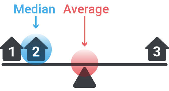
  • Changed “Mean” to “Average.”
  • Updated “Single female householder with own children” to “Single mom households with kids.”

Two New Improvements to Radius Reports

Beyond removing jargon, my partner, Anthony, made two additional improvements to our Radius Reports:

  1. Revised PDF Design
  • For County and State Population Projections.
  • Now, you can tell at a glance if your area of interest is predicted to grow, hold steady, or decline.

2. Revised Excel Design

  • Added percentages and radius projections
  • Design improvements

A Kind Request

When I mess up again and use jargon in the future, please call me out—with kindness. That would be so human of you.